

Environmental Graphics
Visual Design
Timeline
8 weeks
Tools
Adobe Illustartor
Adobe Photoshop
Procreate
Solo project
Green Lake Park Wayfinding
A much needed update
Green Lake Park's new wayfinding and public art displays will bring new life and order to a beloved park.
Problem
Green Lake Park is a beloved park in the greater Seattle area. It was first designed in the 1920s by New York's Central Park designers. Green Lake Park's wayfinding system has become dated and has fallen into disrepair, and a redesign is needed to reflect Seattle's current park patrons.
Solution
The existing signage is now worn and faded, making any park patron walk by without giving the signage notice. Adding new signage with bright colors keeps the attention of avid parkgoers but also grabs the attention of new parkgoers. Having the signs immediately catch the attention of park patrons would help people know where they are, how to get where they need to go and notice existing rules. This new wayfinding and public art in the park will bring new life to a beloved park.


Understanding Green Lake Park
Green Lake Park is a beloved park in Seattle, WA. The park’s wayfinding system hasn’t been updated in years. To start this project, I visited the park and made note of the existing system
and changes that could be made, but keeping in mind that the current patrons of the park
are already used to the Green Lake wayfinding system.

Beginning the Process
After I finished my research, it was essential for me in my design process to begin with a moodboard. The existing signage at Green Lake Park can be easily overlooked, so it was important to me that it stand
out. A bright color palette to catch the park patrons' eyes and easily understood iconography made for information accessibility. I wanted to keep things simple and familiar but also refreshed.
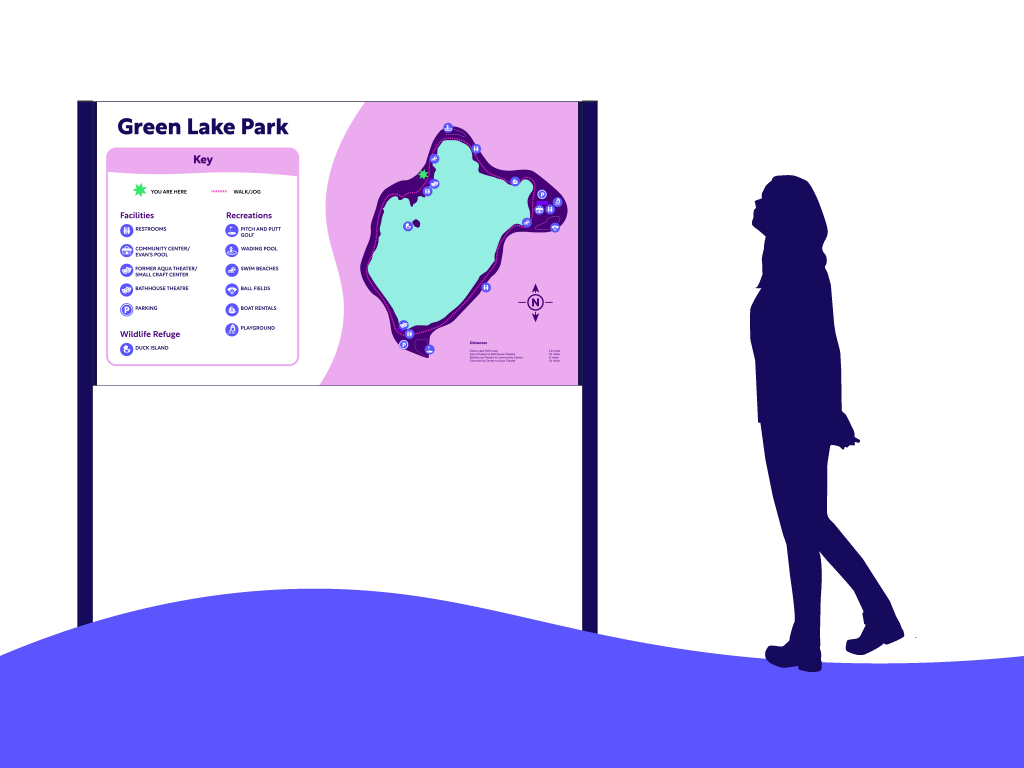
Orientation Sign and Map of Green Lake
A site map aims to quickly orient the user to their surroundings and locations. The current map needed to be simplified, and the colors brightened because it was cluttered and outdated. Adding a simple and bright design and ensuring accessibility will ensure it catches the user’s eye.
Iconography
For the iconography, I didn't want to reinvent the wheel. They needed to be familiar to users. That way, they stay accessible and do not confuse patrons. They also need to be eye-catching.


Public Art
Green Lake Park has beautiful green trees, shrubbery, local animals, and a serene blue lake. The public art would be of animals that you could see around the park and in various areas of the park to help disperse the enjoyment for patrons while they spent time in Green Lake. Because the lovely city of Seattle is cloudy and rainy most of the year, the small brightly colored animal sculptures would be made of brightly colored acrylic/plastic. The dimensions of the sculptures would range from 1–4 ft high and 1–4 ft wide.


Aqua Theater Placemaking
Green Lake Park is already a popular destination for many Seattleites and people in greater Seattle. Walking around the loop, the theater is one of the main structures on the path. You can climb up the stairs and get a beautiful lake view. Having a doodle mural installed on the back of the theater would encourage park patrons to be intrigued and want to stop by and take a selfie, whether for the memories or that fun Instagram post. There would also be a sign pointing the park patron toward the mural to interest them even more, and the sign would also be fun and colorful like the mural.

A Family of Signs
The outcome of this project was a successful family
of signage that is accessible and relays clear and concise information to park patrons of Seattle's
Green Lake Park.